COLORS AND BRUSHES
Hello watercolor friends,
One question I often get before a workshop is what colors and brushes I
use. Of course, it is personal which ones you prefer, but it can be good to know if you are going to participate in a workshop and want to try to do exercises fully. My tip is to buy good paint of good quality, they are more expensive and are more light-resistant, it will be cheaper in the long run. I use Schmincke Horadam, very good colors, at a good price (and I am not sponsored by them in any way).
I do not have many different colors and could manage with fewer. An advantage of using few colors is that you quickly learn how they behave. It will also be easier to keep track of how they mix with each other. Another advantage is that you do not have to think about which of all your colors you should use, instead you immediately start mixing the color you need. It saves time, believe me. I sometimes have participants with several palettes full of different colors. The brush almost dries while they try to find the right color to paint with.
I prefer tube paints, so you can quickly get a lot of pigment in the brush. It also makes it easy to refill the palette when it starts to run out. A good palette I think should include: A warm and clear red (eg quinacridone red light) A cooler red (a little purple, I use alizarin crimson), A warm yellow (any, it does not matter much). I myself use indian yellow, but quinacridone gold also works well. A cold blue (ultramarine blue) I also have a cobalt blue, because it is so beautiful. A more greenish blue, such as phatalo blue or cerulean blue. Some earth tones are also good to have. I use yellow ocher and burnt sienna. I also have a black, neutral tint, but paynes gray probably works well too. Be careful with these, it gets dirty, gray and dead easily. The black one I could be without, but it is good when you want really dark. Avoid black if you are unsure.
Cobalt turquoise is a color that is difficult to mix. It’s the only green I have. Green is usually best if you mix it with yellow and blue colors.
Having good quality paper is the most important thing of all. I use Arches 300 g rough, but Saunders Waterford 300 g also works well. It is important that the paper is real watercolor paper, made of 100% cotton. Do not use a paper called watercolor paper but it does not say what it is made of, it should say 100% Cotton.
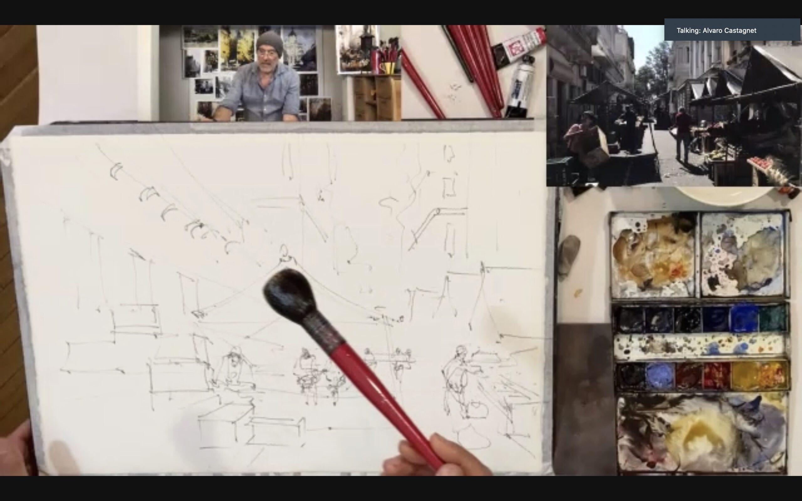
The brushes are the least important. You do not need a brush for a 100 Euros, your paintings will not get better for that. Once I was without brushes and had to borrow a simple school brush. It did not look much to the world and probably did not cost more than 50 cents, but it could paint, for sure. Remember that you are not painting with the brush, you are painting with your brain. I do not use so many brushes, only four. One larger mop, one between brush, and one small. The small one I could manage without, is mostly used to sign the painting.
- Size: Raphael SoftAqua 805 Mop – 2
- Middle: Escoda, Perla series 1430 (white toray), round – 10
- Small: Escoda, Perla series 1430 (white toray), round – 4
- Rigger: COTMAN 333, round rigger 1462
I Also have a thin and narrow brush, so-called rig, for long thin lines, such as power lines. The amount of brushes is the same as the amount of colors, if you do not have that many brushes, you do not have to think so much about which of all your brushes you should use. It saves time and you can concentrate on painting. Of course, when I paint large paintings, I have larger brushes. But if you are a beginner, I do not recommend you should paint big, it is much much more difficult. Quartz sheets are a good size to start with, 28 x 38 cm.
Good luck!
Stefan Gadnell
You May Also Like